In 2024, I led the design of one of TESA's most ambitious projects yet and the first of its kind in the faculty - the TESA website. This platform allows all students within the Faculty of Technology to access academic materials, track department updates, and manage faculty payments directly through the dedicated TESA website. I functioned as the sole designer on this project and worked cross-functionally with the Executive Council, departmental representatives, and the media team to bring this vision to life. Over a 4-month period, I crafted a seamless student experience, modernized TESA's digital presence, and established a robust organizational framework that not only served this resource hub but laid the groundwork for the association's future digital initiatives. This case study is a brief walkthrough of that journey
In 2024, I led the design of one of TESA's most ambitious projects yet and the first of its kind in the faculty - the TESA website. This platform allows all students within the Faculty of Technology to access academic materials, track department updates, and manage faculty payments directly through the dedicated TESA website. I functioned as the sole designer on this project and worked cross-functionally with the Executive Council, departmental representatives, and the media team to bring this vision to life. Over a 4-month period, I crafted a seamless student experience, modernized TESA's digital presence, and established a robust organizational framework that not only served this resource hub but laid the groundwork for the association's future digital initiatives. This case study is a brief walkthrough of that journey
Target Audience🚹
Target Audience🚹
Students currently enrolled in the Faculty of Technology.
Students currently enrolled in the Faculty of Technology.
Staff of the Faculty of Technology.
Staff of the Faculty of Technology.
Prospective Applicants to the Faculty of Technology.
Prospective Applicants to the Faculty of Technology.
Challenges faced ❌
The TESA project was defined by the immense challenge of overcoming a 77-year institutional vacuum. The Faculty of Technology at the University of Ibadan had functioned for nearly eight decades without a dedicated digital identity, resulting in a fractured ecosystem where information and processes lived in paperworks. My primary hurdle was "architectural engineering from zero" i.e. managing the sheer chaos of fragmented data that was previously buried in static PDFs, scattered across physical notice boards, or lost within a generic university portal. I had to navigate deep-seated institutional friction to consolidate decades of disorganized documentation into a single, functional reality. Building this foundation required more than just design; it required a systematic overhaul of entrenched, inefficient workflows. By tackling the "centralization chaos," I architected a system that transformed fragmented data into a streamlined user experience. This involved defragmenting information for students, staff, and applicants, ensuring that academic materials, faculty-specific payment processing, and real-time news were no longer scattered across thereby creating an intuitive environment where users can finally access resources and process essential tasks without the burden of navigating a disorganized and outdated manual system.
The TESA project was defined by the immense challenge of overcoming a 77-year institutional vacuum. The Faculty of Technology at the University of Ibadan had functioned for nearly eight decades without a dedicated digital identity, resulting in a fractured ecosystem where information and processes lived in paperworks. My primary hurdle was "architectural engineering from zero" i.e. managing the sheer chaos of fragmented data that was previously buried in static PDFs, scattered across physical notice boards, or lost within a generic university portal. I had to navigate deep-seated institutional friction to consolidate decades of disorganized documentation into a single, functional reality. Building this foundation required more than just design; it required a systematic overhaul of entrenched, inefficient workflows. By tackling the "centralization chaos," I architected a system that transformed fragmented data into a streamlined user experience. This involved defragmenting information for students, staff, and applicants, ensuring that academic materials, faculty-specific payment processing, and real-time news were no longer scattered across thereby creating an intuitive environment where users can finally access resources and process essential tasks without the burden of navigating a disorganized and outdated manual system.
Institutional invisibility
Information fragmentation
Operational friction
Key objectives?🎯
Key objectives?🎯
The primary goal was to create a single, authoritative digital platform that consolidated academic resources, faculty news, Past events Gallery, payments and administrative workflows into an intuitive interface. Ultimately, the mission was to transition the faculty from a state of digital invisibility to a position of professional authority, creating a polished and performant environment that reflects the rigorous standards of an engineering institution.
The primary goal was to create a single, authoritative digital platform that consolidated academic resources, faculty news, Past events Gallery, payments and administrative workflows into an intuitive interface. Ultimately, the mission was to transition the faculty from a state of digital invisibility to a position of professional authority, creating a polished and performant environment that reflects the rigorous standards of an engineering institution.
Payment gateway
Payment gateway
Faculty news
Faculty news
Centralized Academic resource hub
Centralized Academic resource hub
Streamlined administrative engine
Streamlined administrative engine
Events Gallery
Events Gallery
Project Discovery 🔬
Project Discovery 🔬
The discovery phase for the TESA website was a deep dive into 77 years of institutional history to uncover the specific pain points of a digital-first generation navigating a manual-first system. I conducted comprehensive audits of the faculty’s fragmented communication channels, from physical bulletin boards to buried university subdomains, to map the chaotic flow of information. By engaging with student leaders and administrative staff, I identified that the primary barrier wasn't just a lack of access, but a lack of trust in outdated data. This research formed the blueprint for a centralized architecture designed to bridge the gap between legacy institutional knowledge and modern user expectations. This phase was critical in defining a "function-first" strategy, ensuring that every design choice served to eliminate the friction identified during my initial audits. Ultimately, this phase transformed a massive, disorganized institutional void into a structured, actionable roadmap for the faculty’s digital future.
The discovery phase for the TESA website was a deep dive into 77 years of institutional history to uncover the specific pain points of a digital-first generation navigating a manual-first system. I conducted comprehensive audits of the faculty’s fragmented communication channels, from physical bulletin boards to buried university subdomains, to map the chaotic flow of information. By engaging with student leaders and administrative staff, I identified that the primary barrier wasn't just a lack of access, but a lack of trust in outdated data. This research formed the blueprint for a centralized architecture designed to bridge the gap between legacy institutional knowledge and modern user expectations. This phase was critical in defining a "function-first" strategy, ensuring that every design choice served to eliminate the friction identified during my initial audits. Ultimately, this phase transformed a massive, disorganized institutional void into a structured, actionable roadmap for the faculty’s digital future.
Strategy ⚙️
Strategy ⚙️
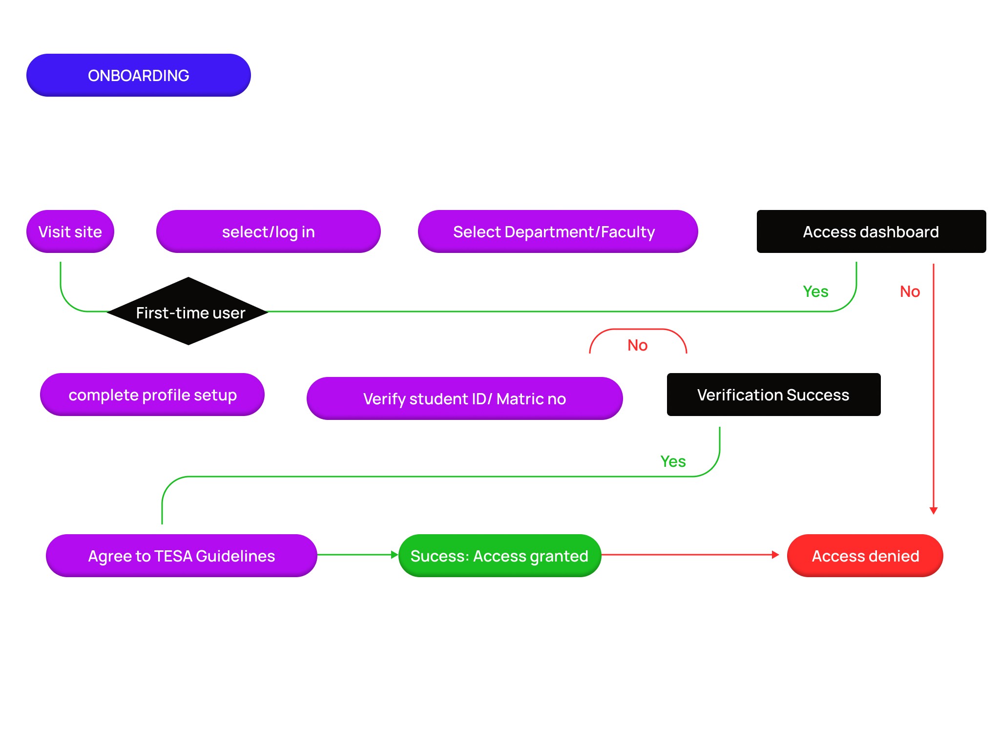
The design process for the TESA website was an exercise in systematic organization and collaborative engineering. I began by mapping the end-to-end user journey, meticulously tracing the paths of students, staff, and applicants to ensure that every critical touchpoint, from accessing academic repositories to processing faculty-specific payments was frictionless and intuitive. This journey mapping served as the blueprint for my initial sketches and low-fidelity wireframes, which I then transitioned into Figma. In Figma, I developed a comprehensive design system that prioritized information hierarchy and structural clarity, ensuring that years of formerly scattered data were presented with professional precision. Execution was defined by a rigorous commitment to detail and cross-functional leadership. I acted as the bridge between technical feasibility and institutional requirements, working closely with the media and development teams to ensure pixel-perfect information display. Beyond the visuals, I led QA walkthroughs and held regular synchronization sessions with the Executive Council to align the platform with governance and student welfare flows. This collaborative approach ensured that the final high-fidelity prototypes were not only aesthetically polished but were also functionally robust enough to serve as the faculty’s definitive digital foundation
The design process for the TESA website was an exercise in systematic organization and collaborative engineering. I began by mapping the end-to-end user journey, meticulously tracing the paths of students, staff, and applicants to ensure that every critical touchpoint, from accessing academic repositories to processing faculty-specific payments was frictionless and intuitive. This journey mapping served as the blueprint for my initial sketches and low-fidelity wireframes, which I then transitioned into Figma. In Figma, I developed a comprehensive design system that prioritized information hierarchy and structural clarity, ensuring that years of formerly scattered data were presented with professional precision. Execution was defined by a rigorous commitment to detail and cross-functional leadership. I acted as the bridge between technical feasibility and institutional requirements, working closely with the media and development teams to ensure pixel-perfect information display. Beyond the visuals, I led QA walkthroughs and held regular synchronization sessions with the Executive Council to align the platform with governance and student welfare flows. This collaborative approach ensured that the final high-fidelity prototypes were not only aesthetically polished but were also functionally robust enough to serve as the faculty’s definitive digital foundation
User Journey
User Journey
low-fi sketches
low-fi sketches
Design system
Design system
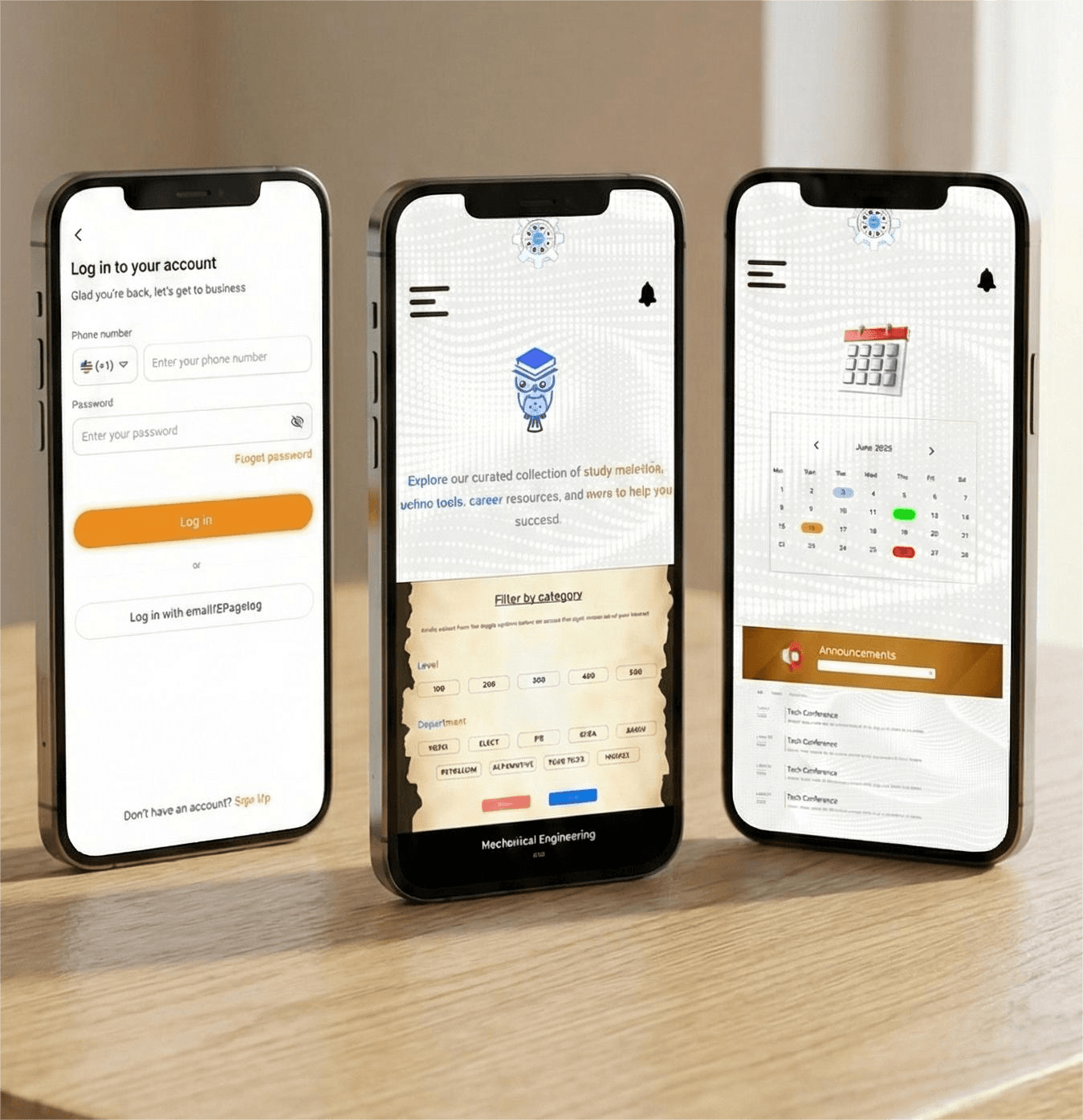
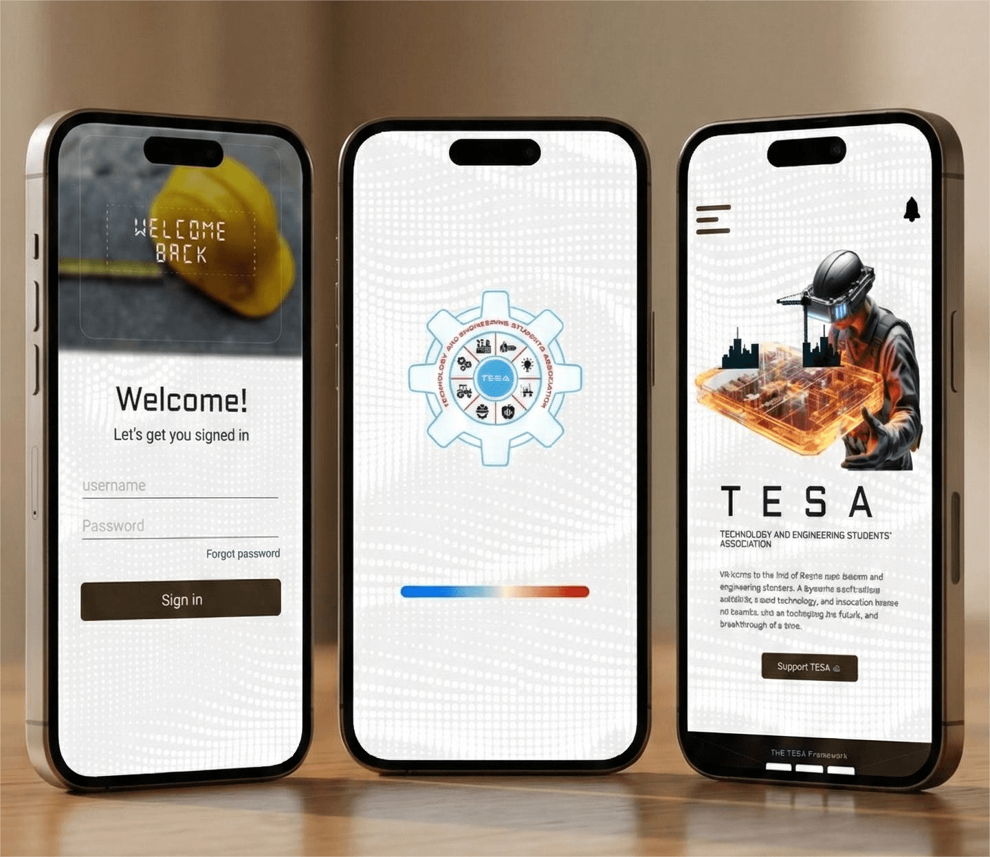
High fidelity screens
High fidelity screens
Design Process 🪄
Let's Design 🎭.
Let's Design 🎭.
The transition from static figma screens into live website marked the pivotal moment where the TESA strategy evolved into a high-performance digital reality. Moving beyond the deep-dive research into 77 years of institutional history, this phase was dedicated to transforming a vast web of fragmented data into a tangible, high-fidelity experience that prioritized structural precision. I focused on refining the UI to ensure every component reflected the technical rigor and professional authority of an engineering institution.
The transition from static figma screens into live website marked the pivotal moment where the TESA strategy evolved into a high-performance digital reality. Moving beyond the deep-dive research into 77 years of institutional history, this phase was dedicated to transforming a vast web of fragmented data into a tangible, high-fidelity experience that prioritized structural precision. I focused on refining the UI to ensure every component reflected the technical rigor and professional authority of an engineering institution.
🎭 Curtain Call
🎭 Curtain Call
The launch of the TESA website marked the culmination of a 77 year wait, transforming the Faculty of Technology’s digital presence from a profound void into a definitive, authoritative online home. This project stands as a testament to my ability to not only design a visually compelling platform but also to architect a complex digital infrastructure from the ground up. By centralizing decades of fragmented information and streamlining critical administrative workflows, I eliminated systemic friction, providing students and staff with an intuitive, high-performance gateway to academic resources, news, and essential services. TESA is more than a website; it is a foundational pillar that empowers an entire institution, reflecting its rigorous standards and setting a new benchmark for digital excellence within the university.
The launch of the TESA website marked the culmination of a 77 year wait, transforming the Faculty of Technology’s digital presence from a profound void into a definitive, authoritative online home. This project stands as a testament to my ability to not only design a visually compelling platform but also to architect a complex digital infrastructure from the ground up. By centralizing decades of fragmented information and streamlining critical administrative workflows, I eliminated systemic friction, providing students and staff with an intuitive, high-performance gateway to academic resources, news, and essential services. TESA is more than a website; it is a foundational pillar that empowers an entire institution, reflecting its rigorous standards and setting a new benchmark for digital excellence within the university.